Navigation
Deliverables
- Project Proposal
- Needs Analysis
- Storyboards
- Task Scripts
- Interface Element Categorization
- Interaction Design
- Interaction Assessment
- Final Report
Interactive Prototypes
Documents
 Information Form
- Informed Consent Form
- Heuristic Evaluation
- Presentation
- Final Presentation
- Prototype Code
Personas
Interface Element Categorization
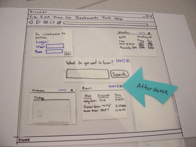
Affordance
One of the affordances in our interface is the little "X" box that closes the boxes in the interface. It's a clear signal to the user as to how to get rid of a box that they don't want. They just click it, and it goes away.
Visibility
We wanted our [Edit] buttons to be clearly visible, so we made them a different color than all of the other text and background.

Mapping
We've spatially located conceptual elements together and grouped them in a box. This allows us to move the box around and keep all the conceptual elements grouped together. It's an easy way to map these elements into a cohesive unit that we can easily manipulate.

Feedback
Our interface gives the user explicit feedback when the user does something. In this case, the user added a bookmark.

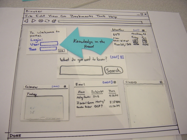
Knowledge in the Head
The user must know his or her username and password. There aren't any contextual clues for the user to get this information.
Knowledge in the World
In this case, the little "X" as a button to close windows is pretty much THE standard. This is something the user may or may not be able to reproduce if asked, but when the user sees the "X," we can be relatively assured that the user will know what the "X" means.

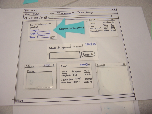
Semantic Constraint
We don't want the user to be able to close the login box, so we don't include the ability to do so.