Developing the Prototype
In this phase we coded an interactive prototype in PHP and AJAX
Revised Interface Design
When developing the prototype, we knew we had to include the Adding Content task, because the entire point of the portal is to bring relevant information to the user. This would be impossible without the ability to customize the interface. Most of the other tasks were very easy to implement, especially since some required no more functionality than just having clickable links. We chose not to implement the login/logout functionality, since that would have required more of a backend than we cared to implement.
We did make some changes since the last phase, however:
 The search bar is now the same width as each column of the page, instead of
spanning columns. We did this because some of the users we interviewed for the
lo-fi prototype wanted to resize their search bar. We didn't really have an
interface for doing that, and we asked them what they would prefer. The users
said that there really wasn't a reason to differentiate the search bar from the
other content, so we just made it a regular box.
 The add content box is not treated as a regular content box anymore. We went
out of our way to make it extremely apparent, since some of our lo-fi users had
trouble with the box. None of our users had a huge problem with the add content
box coming up as a content box, but we felt that we should make it even more apparent
to avoid any confusion.
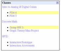
 In the same vein, we wanted to emphasize state changes in the portal. It can be
hard to identify new content items, especially if the content is text-based, like most
of the content in the portal. In order to rectify the problem, when the portal loads
in a webpage, new content items are highlighted in yellow. To ensure that the highlight
is not distracting, it fades over time until it dissapears entirely.
 In the lo-fi prototype, we didn't have an interface for recovering closed content boxes.
To make sure that users can recover their content if they accidentally close it, we've added
an interface to add boxes back in after they've been closed.
The interactions we wanted to provide the user are really no different than the ones we described in our original storyboards. The added functionality of being able to recover content boxes is simple enough to describe in words:
- If a user closes a content box in error, all they have to do is click the "Configure Me!" link, and they will be offered a list of closed boxes to recover. When clicked, the closed content box will fade back in.
As far as interfaces we didn't implement, we didn't implement a real backend, of course, which meant we have no user database. As such, we didn't implement the login/logout functionality. We also didn't implement the ability to edit individual boxes, mainly because we ran out of time. Below is a short description and sketch of the features we didn't implement.
 We didn't implement the login functionality. If there isn't a logged in user, all of
the user-specific fields are left blank, i.e. no calendar events, no emails, etc. Once
the user logs in, all of that information is filled in. Logging in and out of a system
is something our users do all of the time, so we weren't particularly concerned with
testing that aspect of the functionality of the portal.
 We also didn't implement the ability to edit boxes. A good example of this is the weather
content box. If a user wanted to add, say, their hometown to the weather box, they'd click on
the [Edit] link, type in the appropiate zip code, and the weather for their hometown would
appear in the box. Removing weather information is as simple as clicking [Edit] then clicking
an [X] next to the weather entry the user no longer wants.
Prototype Overview
And now for what we actually implemented. As we mentioned earlier, we didn't do any sort of backend, so all of the content for the interactive prototype is flat and pre-defined. We have flat content email, coursework, calendar, and weather boxes that don't do much but look pretty. You can add two more content boxes, one for a fake CNN RSS feed, and another with a bookmark to the HFID website. There are two interactive boxes, the login/logout/configure box, and the search box.
 All of the boxes are drag and droppable within a fluid three column layout. Instead of
having to drag the entire box into a new column, only the mouse cursor has to enter the
desired column when performing a drag and drop operation, resulting in a fast, intuitive model.
We've provided an affordance for this operation as well. The title bar of each box serves as the
drag and drop handle, and as a feedback element, the mouse cursor tranforms into a four-way arrow
when hovering over the title bar. If you don't want a particular box, all you have to do is
click the [X] in the top right corner of the box, which is the ubiquitous standard nowadays for
closing windows/boxes. The box responds by fading from view then disspearing entirely, showing that
you actually did close the box. An important thing to note is that the [X] is inside the title bar,
which typically shows a four-way arrow cursor, but we've explicitly declared that the cursor return
to normal when hovering over the [X]. For added visual feedback, the [X] changes color when you're
hovering over it. In fact, all of the interactive elements in our system visually change when the
cursor hovers over them, either by changing color, having the actual cursor change, or both.
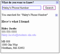
 The interactive content boxes are also flat, but they can change state when you click on buttons.
The search bar, for example, displays canned search results. The login/logout/configure box is an
entirely different animal. As we mentioned before, logging in/out is impossible in our prototype,
but the configure function works. When a user selects "Configure Me," the add content box appears
and prompts the user for what type of content they want to add.
Again, we purposefully didn't include the ability to edit individual content boxes, because we didn't want to build the logic routines behind that. Also, we have a lot of canned data and content because we didn't want to actually code a backend for content generation. This especially was a big deal when dealing with searching, adding RSS feeds, and adding bookmarks.
Other than forcing the evaluators to enter canned queries and data, we didn't really pull the wool over their eyes. Most other features are fully functional.
Tools We Used
We used PHP as our backend language, because it was supported by the server architecture, and the team already knew it. For the AJAX and other visual effects, we used prototype and script.aculo.us. The tools basically allowed us to make AJAX calls and do all kinds of pretty visual effects with very little learning curve. PHP is a language, so that didn't limit us in any specific way, and prototype/script.aculo.us form a Javascript framework that was pretty easy to use and very helpful.
There weren't any real problems with the tools, other than the slight learning curve for script.aculo.us.
 Information Form