Navigation
Deliverables
- Project Proposal
- Needs Analysis
- Storyboards
- Task Scripts
- Interface Element Categorization
- Interaction Design
- Interaction Assessment
- Final Report
Interactive Prototypes
Documents
 Information Form
- Informed Consent Form
- Heuristic Evaluation
- Presentation
- Final Presentation
- Prototype Code
Personas
Final Report
Problem Statement
Olin College is a small school with a diverse, creative group of faculty and students. Since the faculty and students come from so many different backgrounds, it is no surprise that there are many different avenues for information dissemination within Olin's community, both academic as well as extracurricular. Olin's IT department has provided BlackBoard, which is supposed to fulfill the role of a web portal for classes and some students groups. A majority of Olin's students and professors feel that BlackBoard is either poorly designed and executed, insufficient, or both. As a result, a myriad of non-BlackBoard course websites have sprung up, either hosted on faculty operated servers or on faculty web space provided by Olin. Each professor has a different policy, and sometimes professors make use of both a course website as well as a BlackBoard site. Student group and project pages are even more numerous and tend to be hosted on just about any available server, from personal desktop computers being run out of dorm rooms, lab computers, IT servers, and faculty run servers. As the student body grows and changes at Olin, the problem is only getting worse.
The IT department at Olin has rolled out a web portal, with the caveat that the portal is not intended for students. The portal software they are using is a Jenzebar product which is intended to replace the archaic telnet interface that the financial services department had been using. Even though the portal isn't designed for students, it still has access to a number of student-specific data sets, such as grades, course enrollment, GPA projection, degree audit, and financial information. Most of this information is available on the Student Information Services (SIS) page, and is, quite frankly, formatted and presented in a much better format there. The portal has frequent double links for the same page, and often requires the user click multiple times to advance themselves down the navigation tree. Ordinarily, this is not particularly unusual, but in this case, there is only one relevant option for the user to click on each step of the way. The most glaring flaw is the fact that the passwords apparently are stored in plaintext in the database, which, while not a interface design issue, is an uncomfortable security risk. The Jenzebar portal does have some potentially useful features, such as a bulletin board messaging system, but because of its other, detrimental, features, it has never been used other than as a novelty item, if at all.
Of course, there are a number of fairly well designed portals that already exist on the web, such as Google personalized home pages, Yahoo! personalized home pages, and various ISP-specific start pages like myEarthLink. The problem with these pages, of course, is that none of them can access internal Olin resources. Additionally, none of these existing systems are suited for Olin specifically, because they don't have the capability to interface with Olin's email and calendar systems, nor can they access student data regarding grades and billing. In the scope of this class, we hope to design and implement a web portal for Olin students that ties together their academics, extracurriculars, email, calendars, and any external to Olin information they desire--weather, Red Sox scores, etc in a simple and easy to modify package.
Solution Overview
To address the issues described in the above problem statement, the team designed, implemented, tested, and refined a web portal created specifically for Olin students. This new portal incorporates the customizability and attractiveness of a personal home page and campus specific information in a friendly and easy-to-use package. Our final design lines up closely with our initial vision for the portal, including email, a calendar, class announcements and assignments, weather, an academic calendar, and links to useful Olin sites. One aspect of the final design we did not envision was the Olin search capability, which includes search results for all Olin subdomains in addition to web results. This ability makes it easier to find Olin specific information without browsing through unrelated web domains. Our final design effectively addresses most if not all of the issues described in the problem statement, and although many of the features are faked or not implemented, they have served to prove the interface functions appropriately.
Personas and Scenarios
Personas
Scenarios
Final Interface Design

Final Interface Functionality
Here's a short list of the features of the portal.
- Keep track of your email/calendar/class assignments
- Search Google and internal Olin content.
- View the academic calendar.
- Keep track of weather.
- Link to Olin sites.
- Adding content: custom RSS feeds and bookmarks.
- Move boxes around to customize the layout.
Here's a more detailed representation of some interactions
- Search - To search, the user inputs a search term in the box on the home tab and hits enter. The search tab replaces the home tab and shows the search bar at the top with the input query. The results are below, divided into two sections, general Google results and Olin results. The Google results are further tabbed between Web, Local, Video, Blog, and News.
- Adding Content - The most well-developed interaction on the portal is the adding of content. In order to add bookmarks or RSS feeds, the user goes to the "Configure" tab of the portal. The home page is replaced with a few options to add content. The first is to add an RSS feed to a site. When the user clicks this link, an edit box appears with an explanation of what to do. After entering a URL, the portal shows the user the current content of the given RSS feed. The user can then accept this, which takes them back to the home tab and shows a status box indicating that the RSS feed was added and gives an option to undo the action. Adding a static bookmark is similar to adding an RSS feed, but the link is added immediately without a preview.

What was left unimplemented?
- We didn't implement any sort of of backend database, i.e. all our content is flat.
- We don't save user settings at all, every time the user hits refresh, everything is reset to the default.
- None of the "edit" links on the boxes do anything. We didn't flesh out the interface for editing individual boxes. The content of all those boxes are static.
- The RSS search function has not been implemented, and the only page that works is www.cnn.com, for which we make up fake content.
- The add bookmark function does not do anything but add a link to the HFID site.
- We didn't write anything to do the search beyond using Google's search API. We have no internal to Olin search function, athough we fake it by searching olin.edu with Google.
Tools We Used
We used PHP as our backend language, because it was supported by the server architecture, and the team already knew it. For the AJAX and other visual effects, we used prototype and script.aculo.us. The tools basically allowed us to make AJAX calls and do all kinds of pretty visual effects with very little learning curve. PHP is a language, so that didn't limit us in any specific way, and prototype/script.aculo.us form a Javascript framework that was pretty easy to use and very helpful.
There weren't any real problems with the tools, other than the slight learning curve for script.aculo.us. There were a number of strange things to do with JavaScript, but we managed to figure it out in short order.
Design Evolution
Initial Sketches
Our initial sketches prior to the low-fidelity prototype served as rough templates for layout and content, and were not used except in their role in solidifying the design of the low-fidelity prototype.
Low-Fidelity Prototype
Initially, the page is blank with a login link in the top left corner. After login, the prototype is populated with a group of boxes (content) arrayed throughout the page. The login box also changes to greet the user, while offering the "I'm not [user name]!" link to facilitate the log-off operation. The login box also gains the "Configure Me" link, which is an affordance for adding content to the page. Most of the content boxes are unpopulated at this point, and serve to represent the positions and titled to represent possible subjects. Several important things of note:
- "Most of the boxes have a little "X" in the top right, which is an affordance for closing the box. We used the "X" because it's pretty much the de-facto standard in Windows, Linux, and Mac, the three most common operating systems.
- "For the boxes that have editable options, we've included an "[Edit]" link, which is colored differently from all the other links to accentuate it as an affordance.
- "The title bars also serve as an affordance for moving and reorganizing the boxes.
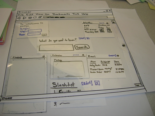
If someone clicks on an email or a calendar event, the portal will open the appropriate email or event in a new page or the appropriate e-mail client. In the class box, clicking on the class title will take the user to the class page, and clicking the homework assignment will take the user to the assignment's page.
Our low fidelity prototype served as the base model of our portal, and although it was not dramatically overhauled during the design process, several important changes were made as we moved into the high-fidelity prototype.
High-Fidelity Prototype
User interviews with the low-fidelity prototype motivated several changes in the implementation of the high-fidelity prototype:
- The search bar is now the same width as each column of the page, instead of spanning columns. We did this because some of the users we interviewed for the lo-fi prototype wanted to resize their search bar. We didn't really have an interface for doing that, and we asked them what they would prefer. The users said that there really wasn't a reason to differentiate the search bar from the other content, so we just made it a regular box.

- The "add content" box is not treated as a regular content box anymore. We went out of our way to make it extremely apparent, since some of our lo-fi users had trouble with the box. None of our users had a huge problem with the add content box coming up as a content box, but we felt that we should make it even more apparent to avoid any confusion.

- In the same vein, we wanted to emphasize state changes in the portal. It can be hard to identify new content items, especially if the content is text-based, like most of the content in the portal. In order to rectify the problem, when the portal loads in a webpage, new content items are highlighted in yellow. To ensure that the highlight is not distracting, it fades over time until it disappears entirely.
- In the lo-fi prototype, we didn't have an interface for recovering closed content boxes. To make sure that users can recover their content if they accidentally close it, we've added an interface to add boxes back in after they've been closed.
The result is the first iteration of our portal, which we then took to our fellow class members for the heuristic evaluation.
Our First Prototype
Link to the First Interactive Prototype

Heuristic Evaluation
The results of our heuristic evaluation can be found here. The list of design violations generated by our reviewers induced us to make the following changes:
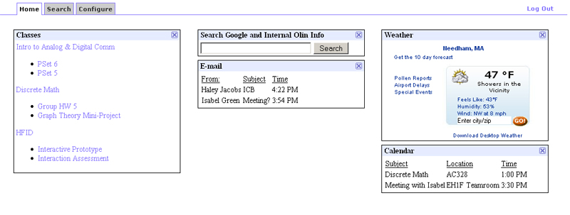
- Tabbed Interface: Our evaluators made several comments about our interface that motivated the change to a tabbed interface. The configure interaction in the first iteration of our portal pushed down and grayed out all the boxes, which was distracting and confusing. All configuration tasks now have their home in a dedicated window which results in the feeling of an 'edit' mode. Our search interaction also had difficulties - search results were being crammed into the content box, which was awkward and difficult for users to browse. Searches now open results in the search tab, which also contains its own search bar.

- Wording: Our attempt to identify the portal with users lead to dialogue that was described as either 'too cute' or 'overly verbose'. The dialogue was been simplified and standardized between tasks.
- RSS Feed Interaction: The process of adding an RSS feed was streamlined, and a radio button eliminated where buttons suffice.
- The appearance of the weather box also changed in the process of making it 'functional'.
Our Second Prototype
Final Usability Test
Returning to our users after implementing changes resulting from our heuristic evaluation, we found that users were generally happy with the interface but desired more content and more detail within the existing content. To address these issues, we:
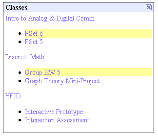
- Added more information to existing content: In the 'classes' box, we added a feature stating class announcements below the class title. The e-mail box was enhanced by adding text information from the body, in much the same way as outlook pops up new notifications with a few lines of text. Highlight times were also extended.
- Added additional content: An academic calendar and links to useful Olin sites were added.
Our Final Prototype
Link to the Interactive Final Prototype

Most Important Changes
Though we made numerous changes between initial sketches and final prototypes, three major changes stand out: searching, "configure me" wording, and tabbed interaction. These are exceptionally important because they reflect instances where our initial observations were incorrect, our design values were off, or we just plain didn't think of it that way.
When implementing our search bar, we thought it made the most sense to just call it a search bar, without explaining what it searched. The primary reason for this was an observation from one of our initial user interviews. The participant remarked, "If I want to search Google, I'll go to Google. I have a Firefox toolbar for that. I want to search Olin and Google at the same time. That's useful." We agreed; searching Olin would be much more useful than simply searching Google. However, by not suggesting this in the search bar area, and instead asking users the question "What are you searching for?", we confused future participants, particularly when we tasked them with finding a persona's Olin phone number. "I don't get where I can search. Here?" one interviewee asked, pointing to the box. We realized that even if we made it clear that there was only one place to search, our users will still have problems. This arises from the now-understood fact that the default interaction with a search bar is that it searches only the Internet, unless explicitly stated, even if the context of the search bar is one that suggests a dual purpose.
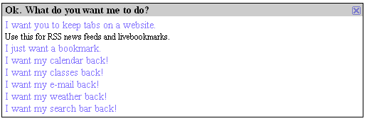
The next design feature to undergo a major change was the "Configure me" wording. Initially, we wanted our users to experience a conversation with the portal. We chose this interaction as a way to design towards Haley, our least computer-savvy persona. However, we also realized that Gordon, our computer guru persona would need the technical jargon to complete the task quickly and efficiently. We therefore elected to deemphasize the technical jargon and instead have primary text that described the goal of the task, such as "I want to keep tabs on a website". While this was a smart move on paper, and generally liked by our interview participants, our heuristic evaluators rejected the idea soundly. The biggest reason it failed in the HE was the lack of consistency between interactions. "OK" in one place became "Hook me up" in another. Additionally, there was confusion between nouns, as the computer provided both sides of the "conversation". One evaluator noted "I can't tell who I am. Am I the portal, or the user?" Self-awareness aside, the point is valid. Our desire to provide a "natural conversation" ended up causing more confusion, and after our HE, we removed the conversational tone while still reducing technical jargon to a minimum. This is one example of designer values not translating to the real world.
Finally, our heuristic evaluators noted the interaction with the "Configure Me" and "Search" functions in the original prototype were clumsy and could be improved upon. As part of our goal to make the site as minimalist as possible, we chose to perform all the interactions on one page, without clicking or redirecting to a secondary page. This meant that the "Configure Me" interface and search results appeared on the same page as the main content. The "Configure Me" interface appeared at the top of the browser window, shifting the contents of the page down to make room. In the same vein, search results appeared in the same "box" as the search bar, shifting middle column contents down. Both of these caused the evaluators to complain. From a technical standpoint, it also made little sense, as interactions with other boxes on the page were still possible, even though they had been "grayed out."
We decided that an alternate interaction path was needed for both the search function and the "configure me" interface. After discussing it in a meeting with our evaluators, we chose a tabbed interface. The primary reason for this was keeping modes separate as well as not confusing the user with content that appears from thin air. This received positive feedback from our final usability test participants.
Most Effective Evaluation Techniques
From the above, it's no surprise that the most important set of evaluation data came from our heuristic evaluators. By providing us a "laundry list" of usability problems, we were able to quickly see where we needed the most work. Additionally, our evaluators helped to examine our biggest problems of modes in the interface ("Configure Me") and dialogue with the system.
Teamwork Breakdown
| Task | Task Weight | Adam | Doug | JJ | Jon | |
| Prototype Rewrite | 60% | 10% | 30% | 30% | 30% | |
| Final Presentation (Prep) | 10% | 100% | 0% | 0% | 0% | |
| Final Presentation (Delivery) | 10% | 25% | 25% | 25% | 25% | |
| Final Report | 20% | 25% | 25% | 25% | 25% | |
| Total | 100% | 23.5% | 25.5% | 25.5% | 25.5% |